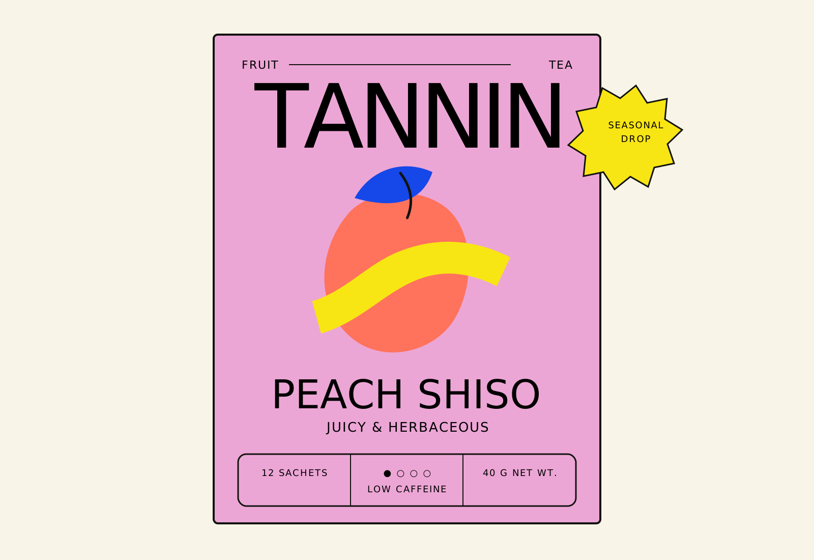
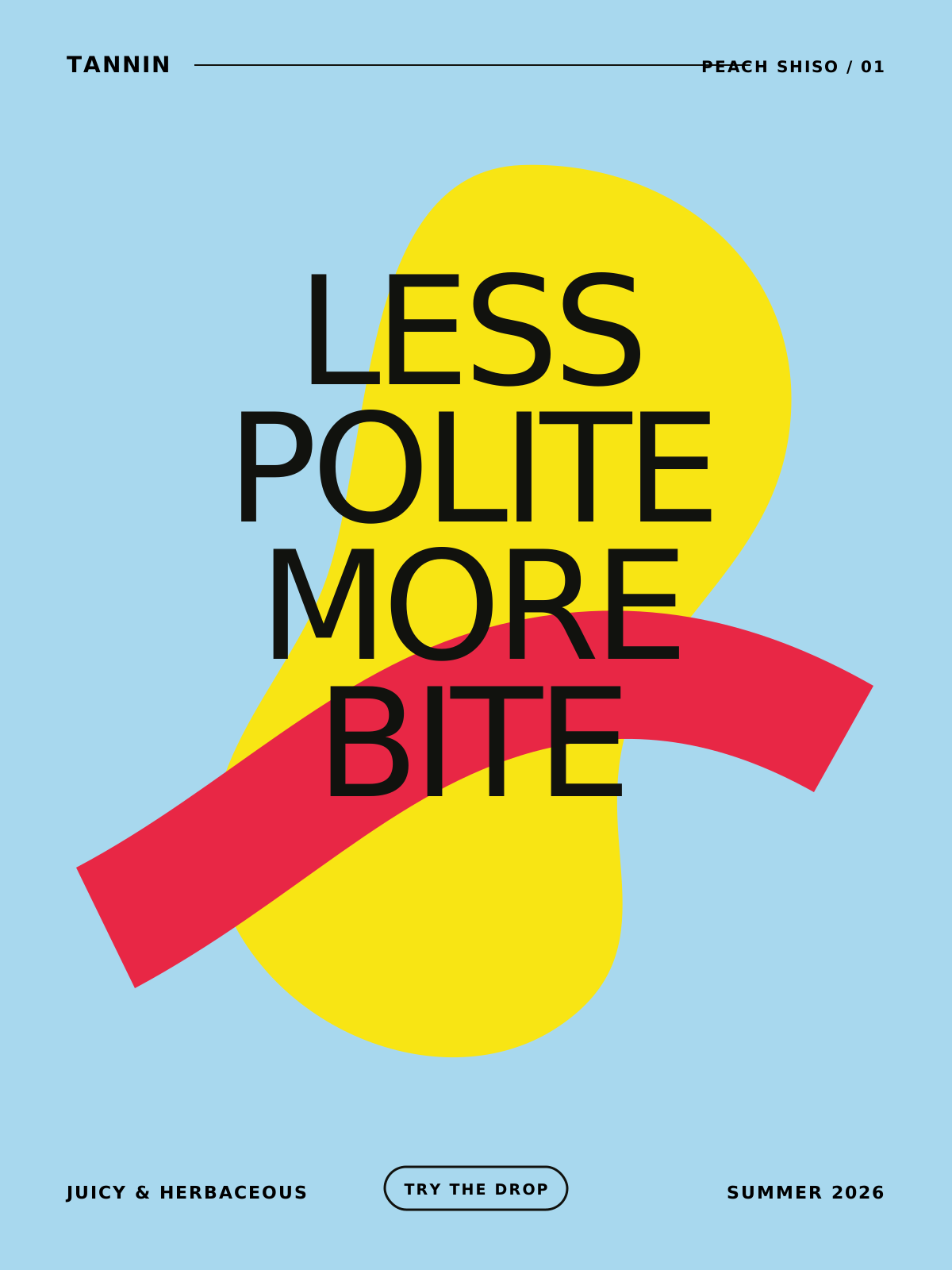
Read the TANNIN example Brand Skill, inspect its visual references and editable assets, and download the complete folder.
A Brand Skill gives an agent the guidance and assets to work with one brand. Explore this example for TANNIN, an urban tea room identity, then download the folder to use with your agent.
Original TANNIN identity: packaging, posters, signage, and everyday objects.
Based on TANNIN, a portfolio concept by Anna Kuziuk. This unofficial demonstration combines original reference boards with reconstructed SVGs, working values, and new applications. TANNIN is not a Rainbrand customer.
Download the TANNIN Brand Skill
Markdown guidance, visual references, editable SVGs, fonts, and examples.
A Brand Skill contains one brand’s identity. The optional Rainbrand
Skill teaches an agent how to
use Rainbrand.
Tea without ceremony. Build around oversized editorial type, grainy botanical forms, candy colors, and small, practical labels. The result should feel like tea in daily city life: a cup in hand, a bright carton on a shelf, a poster seen across the street.
Read assets/manifest.json and inspect the source board closest to the requested output.
Read the relevant references below. Use the source images to judge proportions, texture, and density; prose alone cannot establish those details.
Reuse a bundled mark, illustration, or template where it fits. The SVGs are editable reconstructions; the original boards are visual references.
For new imagery, generate the artwork separately, then compose exact type and labels in SVG or design software. Follow references/generation-guidance.md.
Render the result and inspect it at its intended size before delivery. Include an editable source and a preview when the task calls for a visual artifact.
Avoid generic wellness minimalism, beige-only luxury styling, watercolor botanical clipart, evenly spaced centered layouts, and invented Japanese or other Asian visual shorthand. Gradients are not a primary brand device. Never stretch a raster logo. Preserve deliberate overlap without obscuring product facts.Use the bundled Bodoni Moda and DM Sans as production substitutes. Their use does not establish the original identity’s typefaces. Treat palette values and SVGs as reconstructed working assets.
Can you identify the dominant statement immediately? Does the illustration have a distinctive shape and visible grain? Are color, overlap, and small labels doing useful work? Is every word correct, every essential fact readable, and every linked image or font available? Compare the result with a source board before calling it finished.See ATTRIBUTION.md for provenance and README.md for local use.
Extract the ZIP, give the folder to your agent, and adapt this starting prompt:
Use the TANNIN Brand Skill to create [artifact] in [format]. Start withSKILL.md, read the references relevant to the task, and inspect the visualsource boards. Use the bundled assets and fonts where they fit. Do notinvent product facts or claims. Review the result against the Skill andfix any differences before returning the finished artifact, with aneditable source and preview when relevant.